
From dense navigation to a “choose your own adventure” one.
For each stage of parenthood, there are many topics that have several subpages. Some of those topics are shared between the stages, some other not. On their website, the hierarchy wasn’t always clear. Sometimes, the left navigation displayed subpages, sometimes, sibling pages.
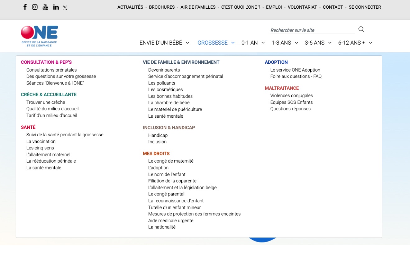
To remedy that, we opted to let users choose the way they wanted to navigate: either by stage, by topic or by search (in fact, the search wasn’t very performant and rarely used).
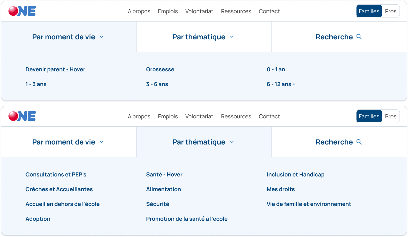
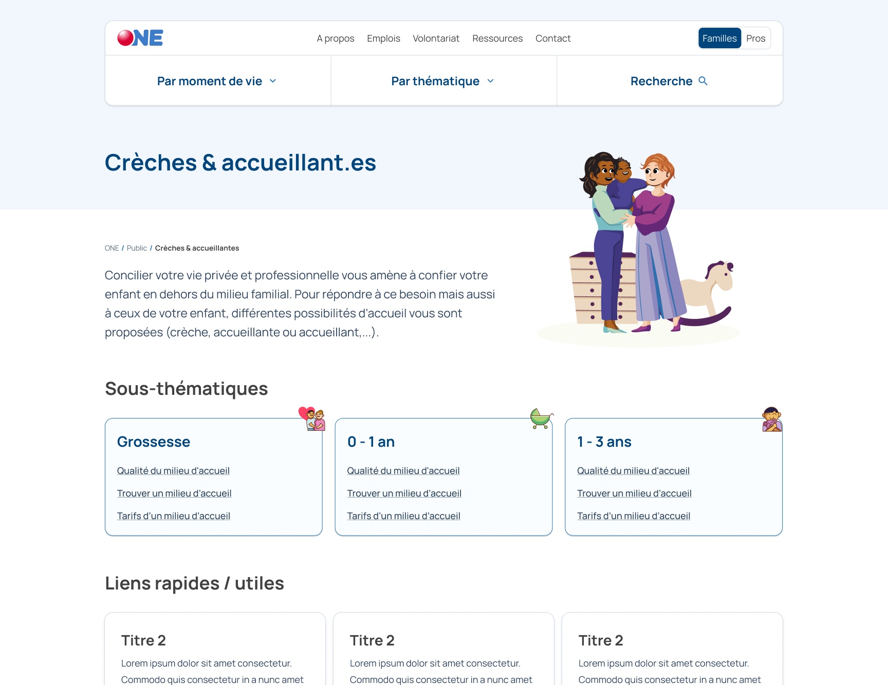
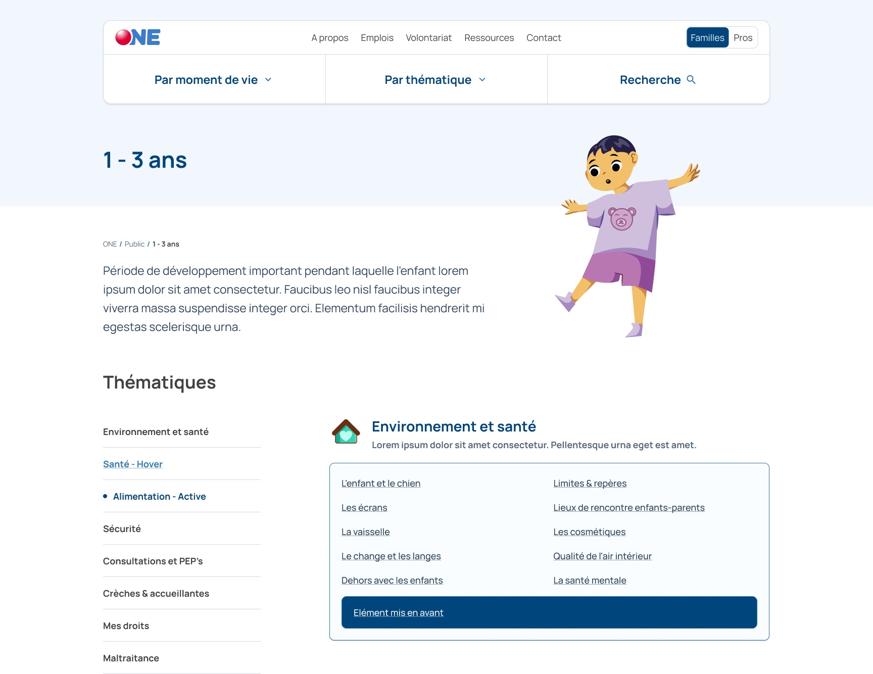
Now, each stage and each topic has its own page, different from each other for easier recognition, that lists its content by the other factor. So topics are divided in stages and stages are divided in topics. Also, the search is on the same level, so that users who know exactly what they’re looking for can access it more easily.
Working with illustrations
The old website was using a lot of stock photography, which made what could be a very personal and warm website, a rather cold one. Because taking pictures of newborns and children to put them online is not ideal, we worked with an illustrator to draw all the stages and topics so they could more easily and repeatedly be identified.
Creating new components for variety and ease of use
Technically, this project was also an opportunity to rework the CMS. We took it to design new page and sections templates, as well as new components so the editors would have an easier time writing articles, but also more possibilities to highlight specific contents.
Speaking of articles, those templates have been reworked to make them lighter to read, compared to the older, very dense pages.
Testing it
We finally tested the new architecture and design with Figma prototypes. People were able to access information much quicker and were also pleased with the new visual direction and illustrations.