From nothing
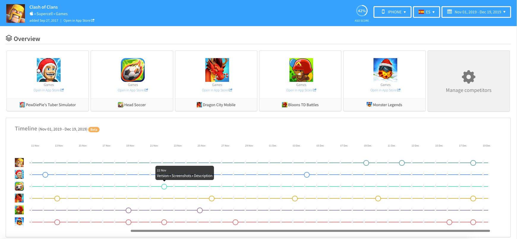
The timeline was a popular feature amongst AppTweak’s competitors. The intent is to be able to see updates to any metadata of your app, but mostly of your competitors. This way, you can identify trends, patterns or seasonality (games love adding pumpkins to their icon when Halloween is around the corner).
Looking at other ASO platforms, it didn’t always seem easy to compare changes or to get an overview of several apps at the same time over time.
To drafty things
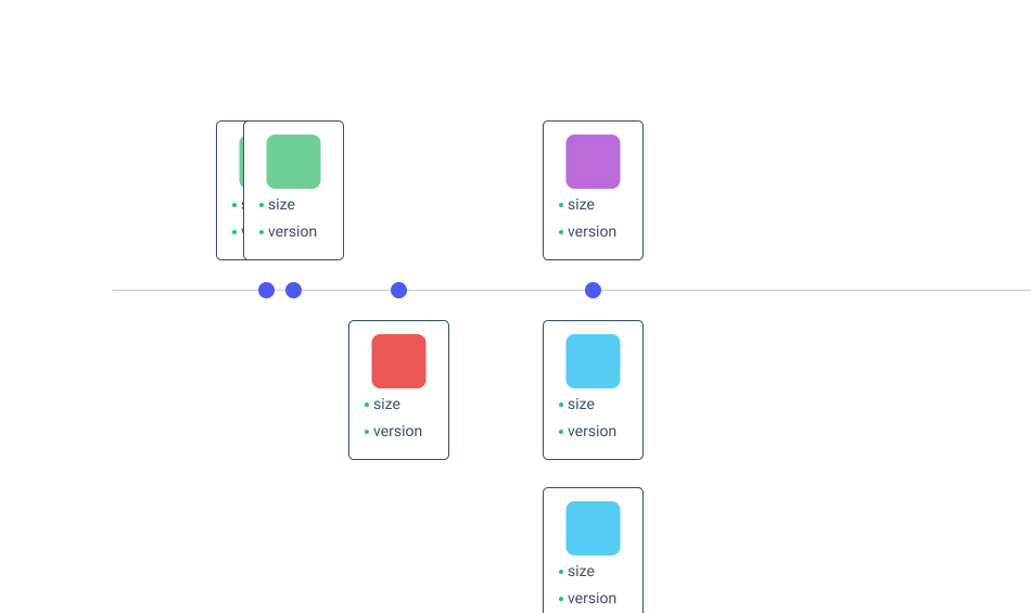
When thinking of a timeline, I really pictured time. And a line. So that you could see the things along the time. On a line. You know what I mean?
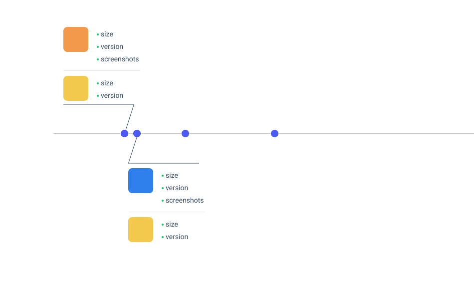
So I drafted a few tests, to explore limitations which became obvious: showing a lot of info on the same line. Because there was a need to compare several apps that could have several changes at the same time, it would not work.
To a final design
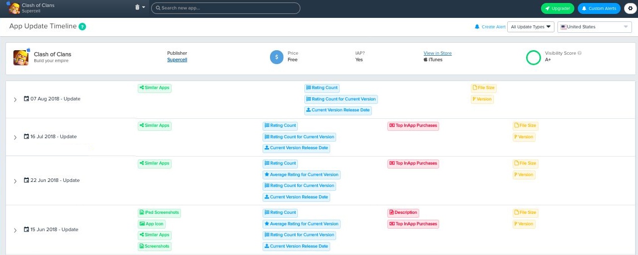
A compromise had to be made. It would have become too complex of an interface if we wanted to show everything at the same time. Our choice was to not show exact metadata updates directly. This way, the user can focus on spotting trends or seasonality.
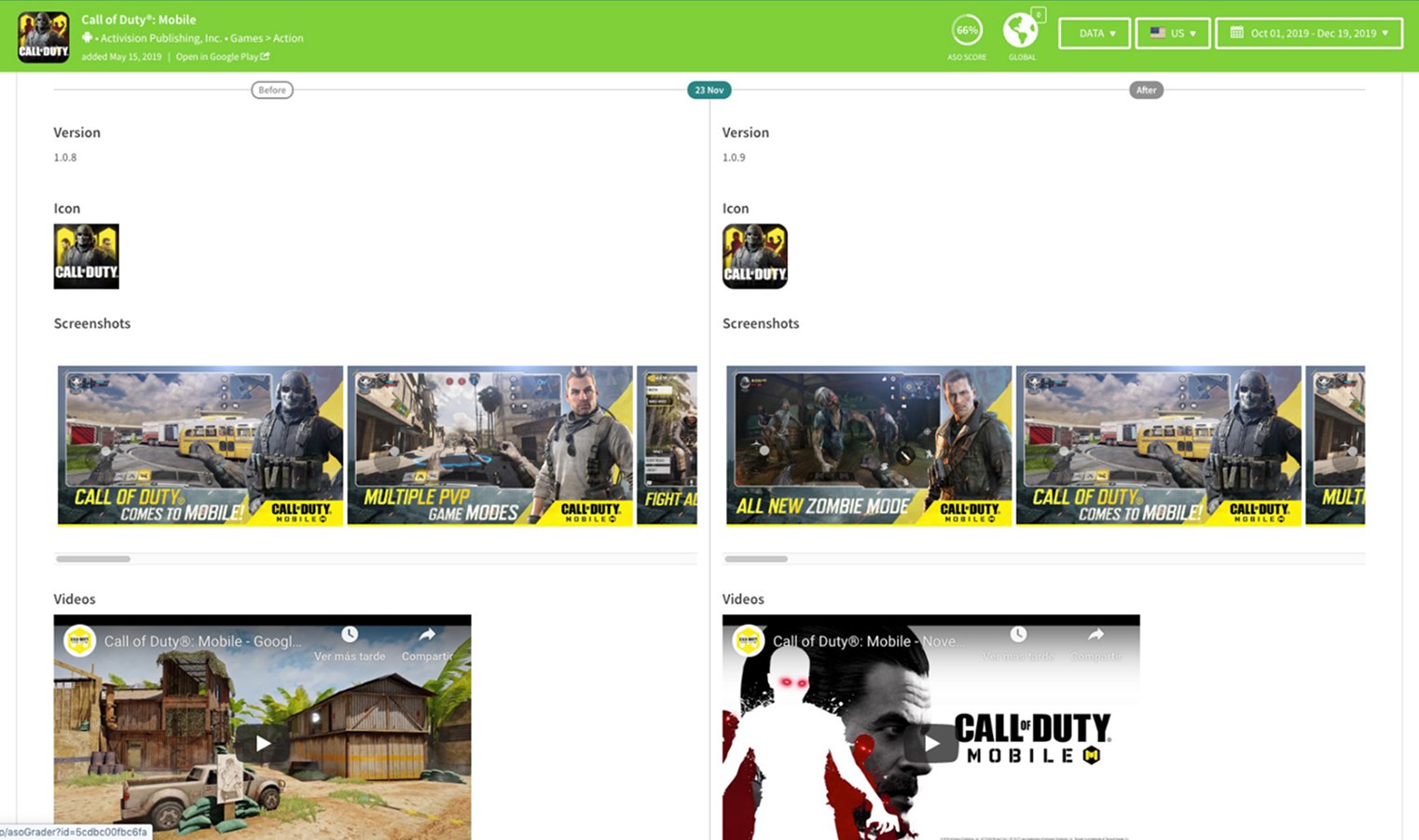
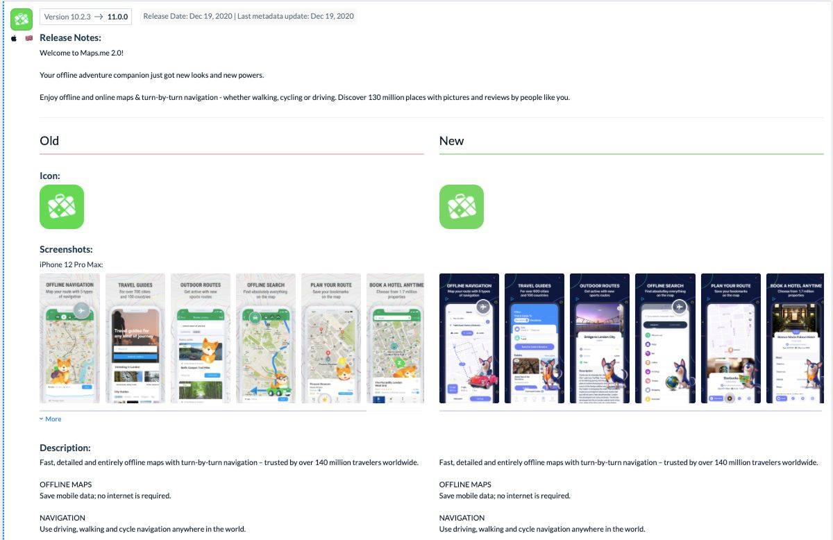
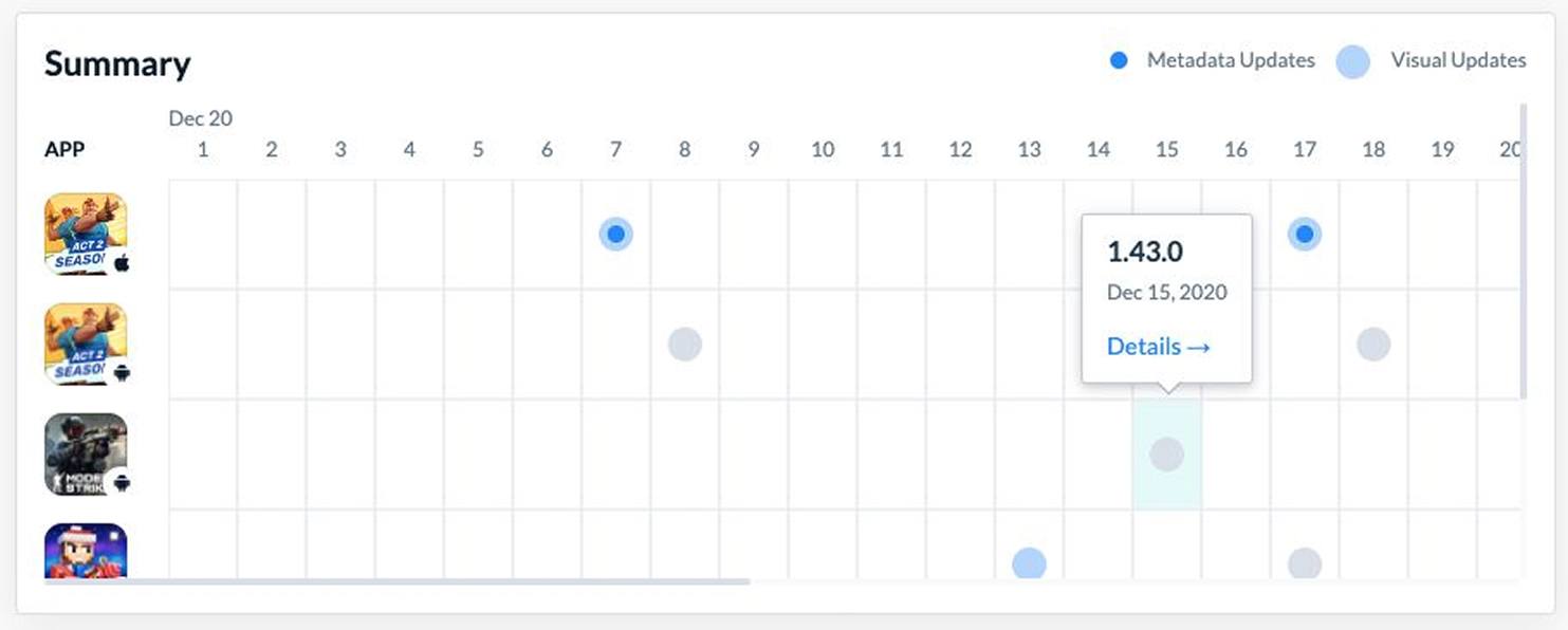
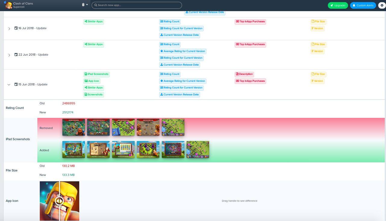
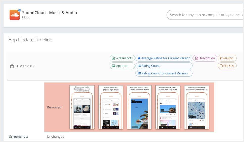
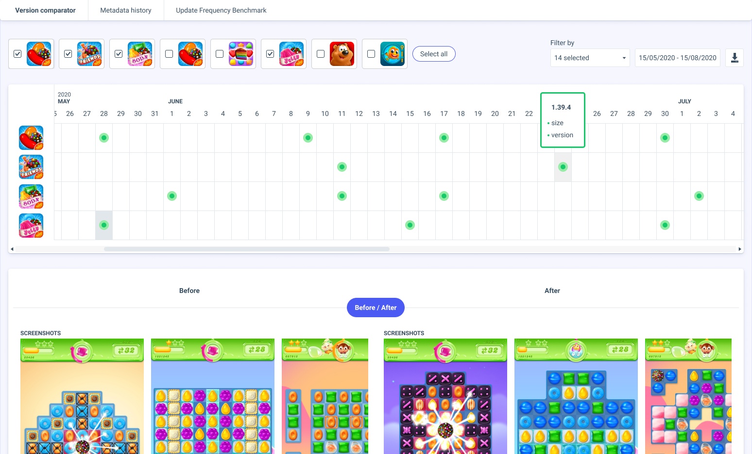
It ended up looking more like a calendar. Which makes sense, because, you know, the time and the line thing. This way, it was easy adding many apps to compare. You get a preview of the updates when hovering a dot and you can see all of the before / after when selecting it.
I worked together with the front-end developer to implement it: he was doing the feature-end of it while I was doing the front-of-the-front-end.
The way the company worked at the time didn't allow me to test the feature with users. However, the customer success team reported that the reception was great and got praised on different occasions.
Social proof?
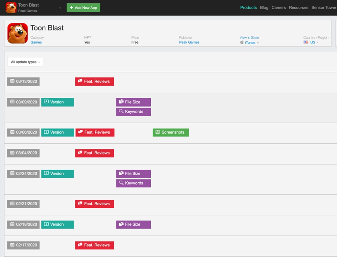
Not long after our release, some of our competitors came up with updates of their own which felt like a success.